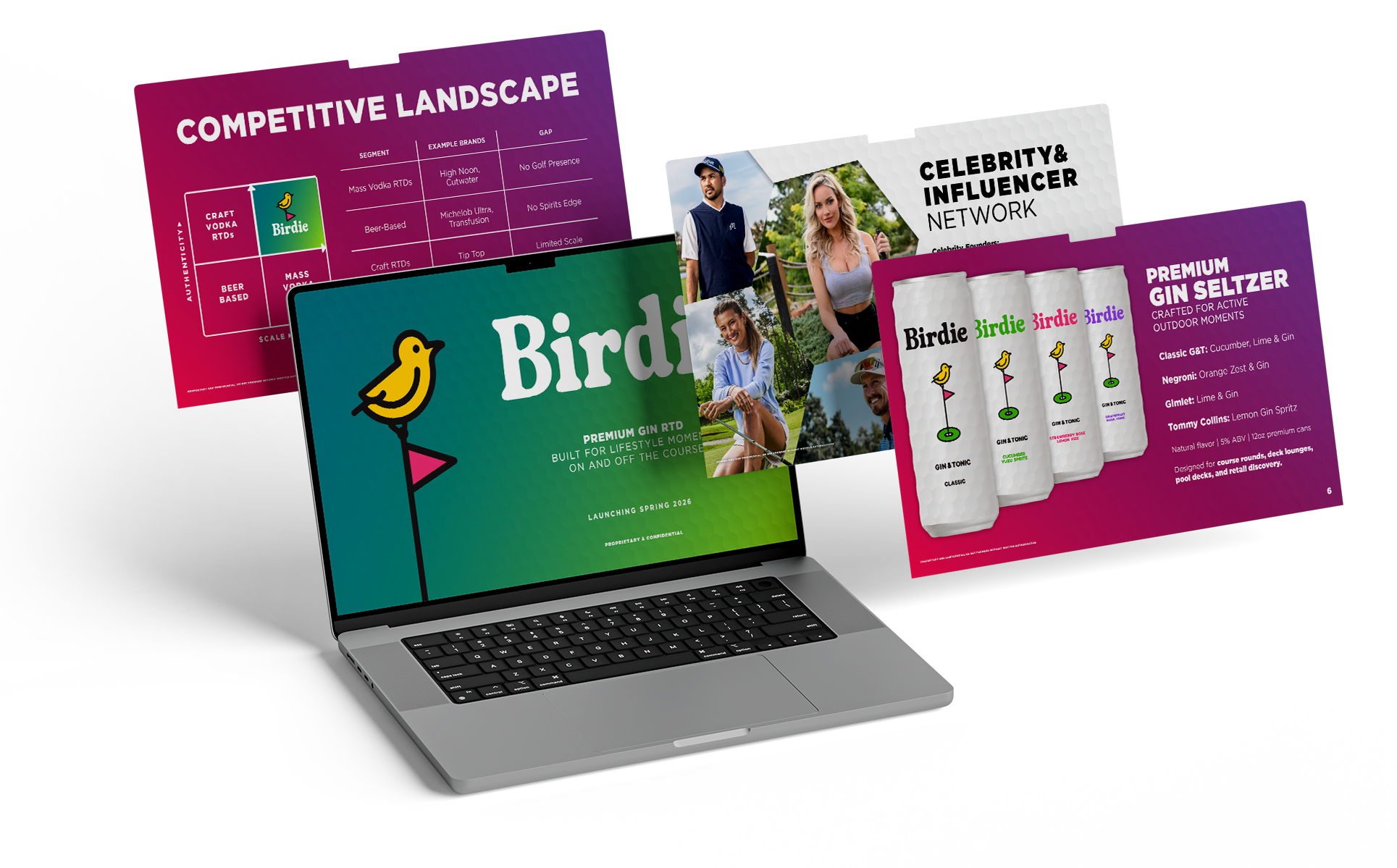
Birdie
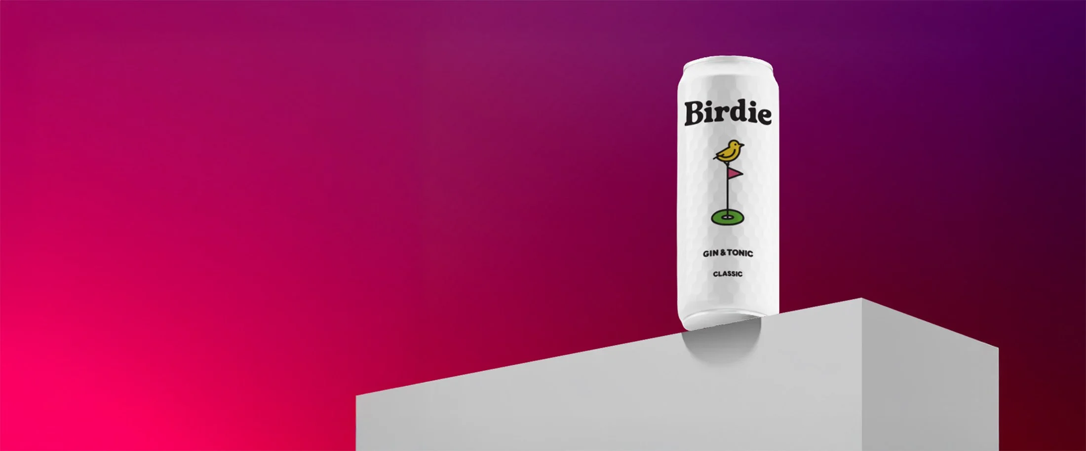
Birdie is a premium, gin-based Ready-to-Drink (RTD) cocktail crafted specifically for the golf lifestyle. Launched into a market flooded with sugar-heavy vodka seltzers, Birdie needed a visual language that spoke directly to the affluent, active golfer while maintaining a sophisticated, minimalist edge. The dimpled texture creates high "thumb-stop" value in digital marketing and physical shelf-presence.
Simple, yet Sings
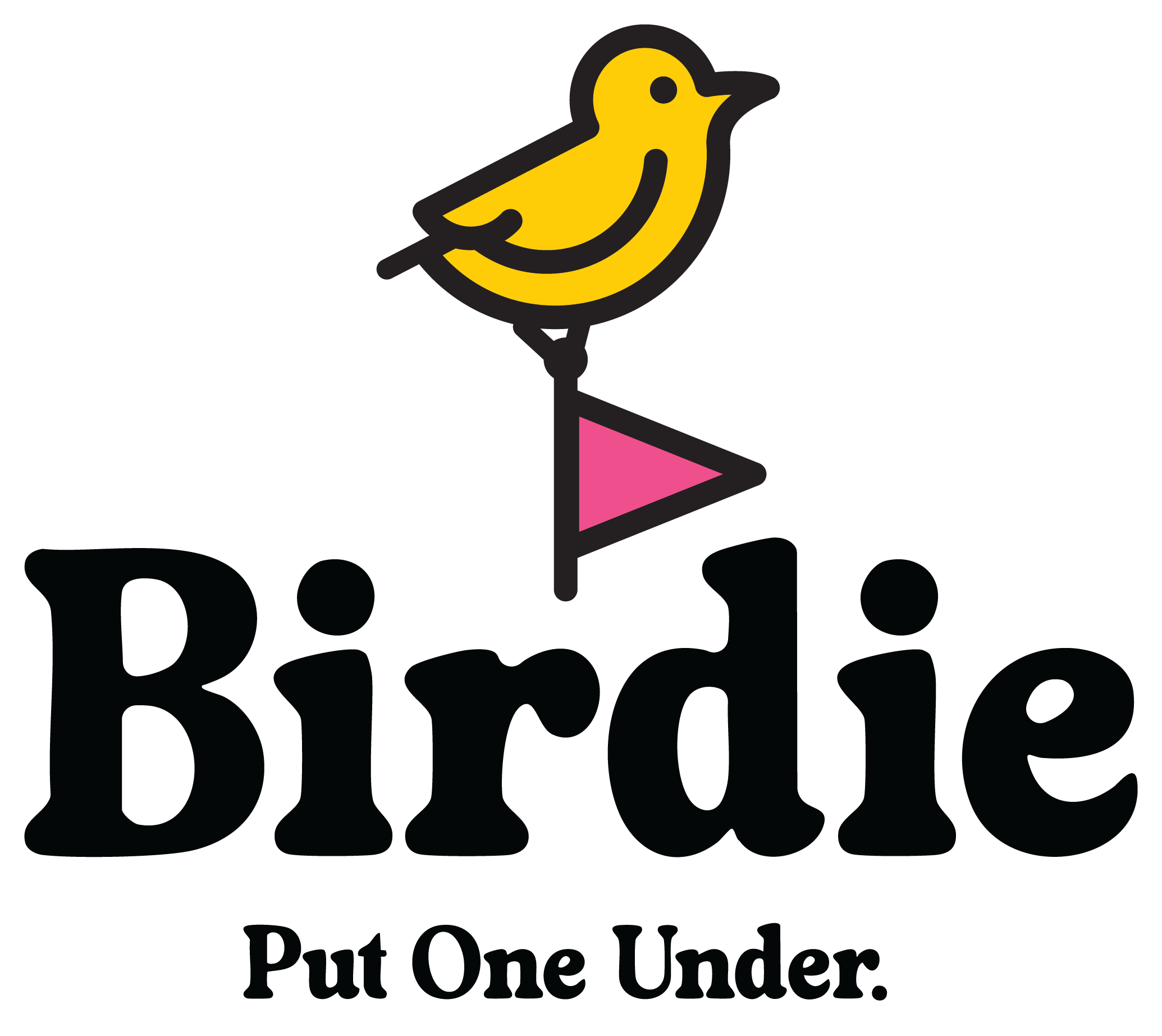
I developed the tagline "Put One Under." It serves as a dual-meaning call to action—playing on the golf term for a birdie (one under par) while inviting the consumer to enjoy a cold beverage.
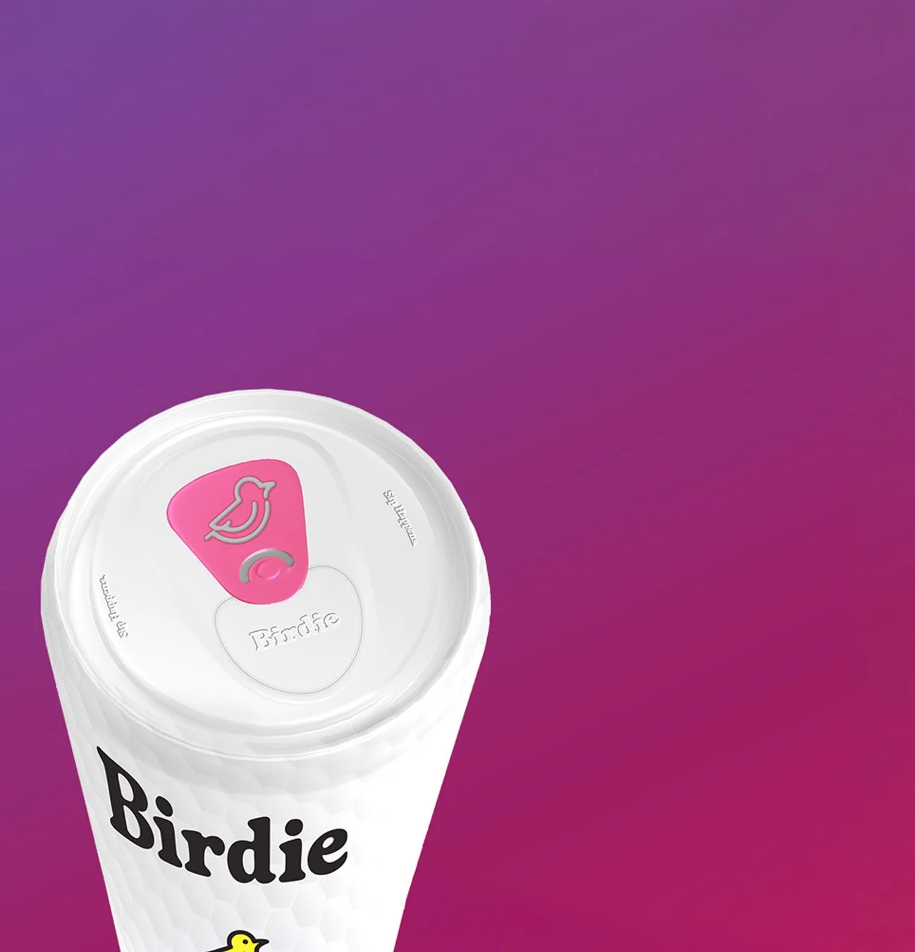
I moved beyond the flat label. The flagship packaging features a premium matte white finish with integrated golf-ball dimpling. This provides a unique hand-feel and an instant visual cue that resonates with any golfer before they even read the name.
Tee It Up
Tee it Up Created a unified visual system across investor decks, social media, and physical packaging that reflects the Birdie lifestyle and relays it’s unique market opportunities to investors and consumers alike.